March 2025
Branding My Portfolio: Colors, Fonts & UI Decisions
A well-structured website means nothing if it doesn’t look and feel right. Branding and UI aren’t just about visuals—they define how visitors experience and interact with the site. I wanted my portfolio website design to reflect both my skills and personality, while ensuring it remained functional and user-friendly. This stage of the build was all about refining the color palette, typography, and design elements to create a seamless experience.
The Story Behind the Color Palette
The color palette is sky layer themed. For anyone who knows me personally, they know my passion for clouds. This all came from reading Gavin Pretor-Pinney’s The Cloudspotter’s Guide: The Science, History, and Culture of Clouds. Pretor-Pinney suggests that our disconnect with clouds results from modern society’s emphasis on productivity and clear skies, whereas in the past, poets, artists, and religions took inspiration from the variety and drama clouds bring. After reading the book, I gained a renewed appreciation for clouds and started advocating for the joy and mental well-being that comes from observing these natural wonders.
Luckily for me, I’ve moved to an area with coastal mountains where some of the most fascinating and dramatic cloud formations occur due to the land, sea, and change in elevation. One October sunset at Kitsilano Beach, I watched vibrant sunset light fracture through the clouds across the horizon. I took a photo, and that image became the inspiration for my website’s color palette, which is now the homepage landing image.
Finalized Color Palette:
Sky Layers Theme
Deep Reddish-Brown: #311212
Warm Golden Yellow: #FFC65C
Rich Sunset Orange: #FF8C42
Muted Earthy Brown: #A68A64
Deep Charcoal Grey: #2F2D2E
Soft Cloud White: #FFFFFF
This palette reflects both my personal interests and my professional branding. It’s visually distinct but also functional, ensuring strong contrast and accessibility.
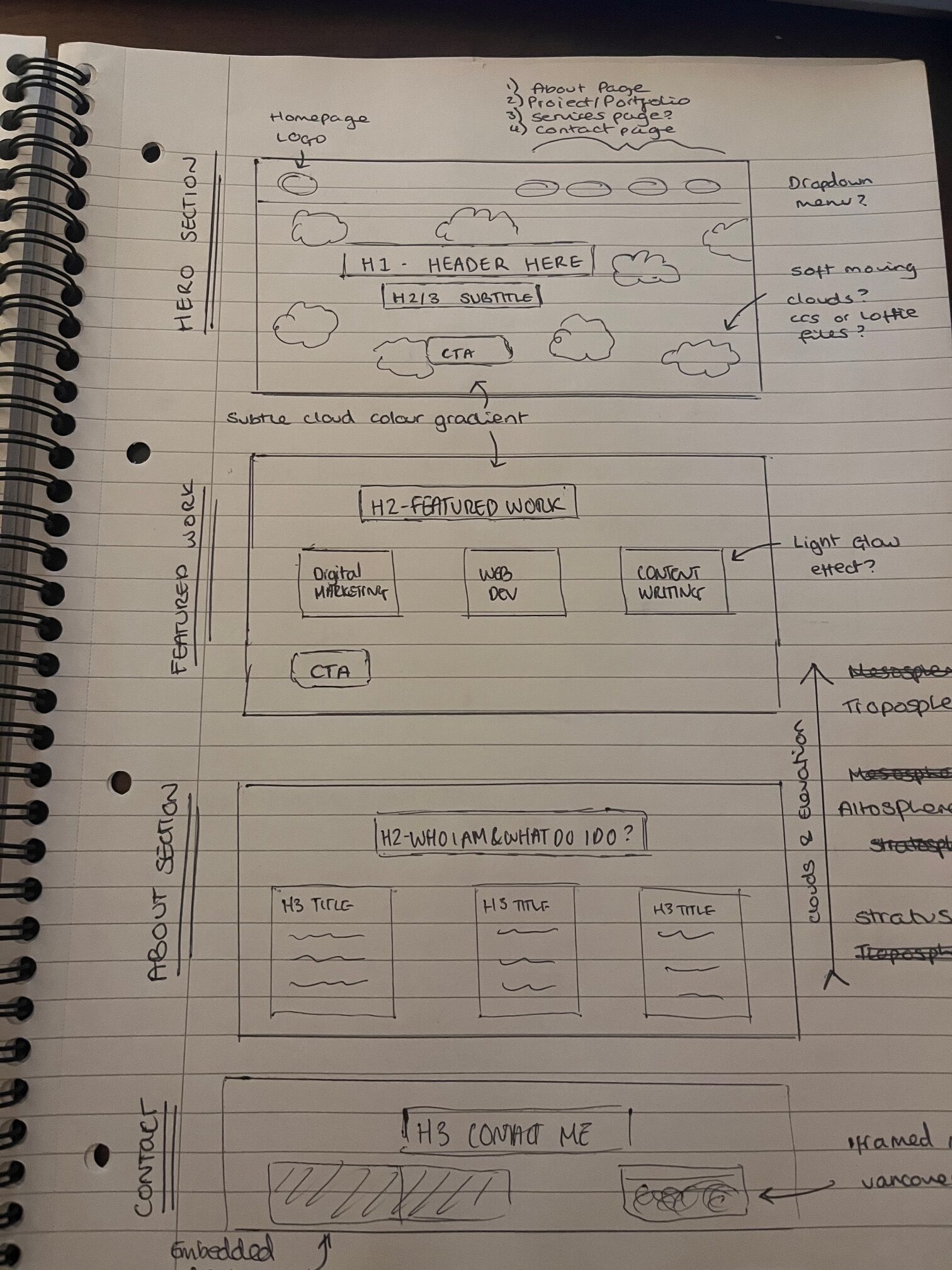
Wireframing & UI Challenges
So, I took to the drawing board—literally. I sketched out wireframes for the pages, envisioning how they could look. I built an initial version to see the concept come to life. Initially, I considered a blue sky gradient that transitioned from deep blue at the top to lighter blue as users scrolled, symbolizing ‘blue sky thinking.’ Floating clouds would appear with randomized timing and positioning. The idea was to display different cloud formations from the stratosphere to the troposphere.

Challenges with the Cloud Concept
While the concept was visually exciting, it posed several UI challenges:
- Distraction from Content → Moving clouds drew too much attention away from the text and elements.
- Scalability & Responsiveness → Ensuring a smooth, adaptable experience across devices proved difficult.
- Performance Considerations → Too many animated elements slowed down page loading times.
- Difficulty with Figma → I’m not very experienced with Figma, so building the wireframes took longer than just creating the page in the staging environment. Because of this, I relied more on sketching by hand, but I plan to keep learning and improving my Figma skills.
Final Design Decision
I decided to balance aesthetic and functionality by removing the floating clouds and instead using the Kitsilano sunset photo as the homepage visual. The palette and webpage design were based on this image, ensuring a cohesive and scalable approach.


Next Steps – Development Begins!
Now that branding and UI are set, it’s time to start building the foundation of my portfolio website. In my next update, I’ll walk through setting up my site in WordPress, choosing essential plugins, and handling CSS for custom styling to match my design vision.
I’ll also be collaborating with Noa Okurama and Kristy Cussen, talented artists and UI designers, to refine the final look and ensure a polished, user-friendly experience.